
Saturday, 21 December 2013
Friday, 20 December 2013
My Response to Feedback on my Front Cover
Now that I have obtained feedback on my front cover I know how I can improve it to make it look more like a magazine of the Indie Rock genre and make it appear more professional.
To improve I will:
- Change the colour scheme so that it works better with the Indie Rock genre
- Change the font used on the masthead
- Add more features
- Make the features smaller
- Change the headline font or colour
- Change the headline
- Change the tagline
- Make the tagline bigger
- Make the barcode smaller
- Make the plug smaller
- Improve the quality of the photo/change the photo
Thursday, 19 December 2013
Feedback on my Front Cover from Peers

Jodie-
- The colour scheme is bad but I realize that it works well with the outfit the model is wearing.
- There is a lack of features.
- I like the border used.
- It's hard to read the headline font however the font does looks good.
Kate-
- The picture is nice and has good lighting.
- The layout is good.
- A good range of fonts used.
- The bar-code is too long.
- The tagline isn't very effective.
Hollie-
- The colour scheme is good.
- The masthead doesn't stand out enough.
- The footer looks good.
- The white text blends with the white background.
- The tagline is too small.
Wednesday, 18 December 2013
Mini Evaluation of my Front Cover First Draft
My front cover first draft
has helped me to decide what looks effective and what could possibly be
improved in relation to the layout, font and colour scheme etc. I like the
layout of the cover and how the text falls around the model ensuring the main
features of the model are not covered. I also like how the models head covers
part of the masthead to give the impression that the magazine is well
established and professional. In addition to this I think that the positioning
of the 'plug' is very effective as it fills a large space, making the magazine
appear less empty. This is similar to the barcode, date, issue number and price
which also fill spaces giving the magazine a full and exciting look. I have
used 3 main fonts on my front cover which are 'Ariel narrow', 'Impact' and
'Brush Script std'. I like the use of the Ariel narrow font on the masthead
because it’s simple and easy to read which is essential for the masthead,
however it’s not very memorable and so this may be something that I edit when I
create my second draft. I do however think that the use of the font 'Impact'
throughout the cover is very effective as it is bold and stands out so attracts
readers. It is also easy to read, which is another plus because it needs to be
readable so they know what is featured in the magazine. I also think that the
use of the 'Brush script std' is effective as gives the cover variation and
looks almost handwritten giving it a personal touch. I used the colour scheme
red, blue, grey and white on the cover. I like this colour scheme however I
believe that the use of the blue is too overpowering and doesn't reflect the
Indie Rock genre the way I had hoped, so on my second draft I may tone down the
blue so I only use it in little places such as the plug and small headings.
This consequently means I will have to change the border colour to
something darker such as grey. Overall I believe that this is a good first
draft which although may need some improvements, achieves the look I'm hoping
to achieve on my final front cover.

Front Cover Making Process
This is a step by step process of how I made my front cover, with print screens and comments to show exactly how it was done.


Monday, 16 December 2013
Experimenting with my Favourite Images for my Magazine Front Cover
These are my 3 favourite images that I am considering using on my magazine front cover:

Out of all the photo's I took for my front cover I chose these 3 as my favourite images because from looking at existing front covers I have decided that these are the most conventional images. I also think that these photo's portray the message that I am trying to achieve the best. I am going to experiment with these images by editing them on Photoshop so that I can decide which will look the best on my front cover.
Experiment 1:

The Process:


Experiment 2:

The Process:


Experiment 3:

The Process:


Friday, 13 December 2013
Photoshop Editing Techniques
Before I started the editing process I looked at a couple of Photoshop editing tutorials using YouTube to widen my knowledge on Photoshop.
This is the first tutorial I viewed which explains how to change lip colour using Photoshop. The tutorial gives a step by step guide allowing me to clearly see how the look is created. This is useful to me because I am considering altering my models lip colour to have a darker appearance allowing me to achieve the Indie Rock look that I am aiming to create on my front cover.
This is the second tutorial video I looked at which explains how to change the colour of a background in a photo using Photoshop. The tutorial, like the last, gives a step by step guide of how the technique is done which may help me when I come to editing my final photo for my front cover if I decide to change the background colour in any way.
Wednesday, 11 December 2013
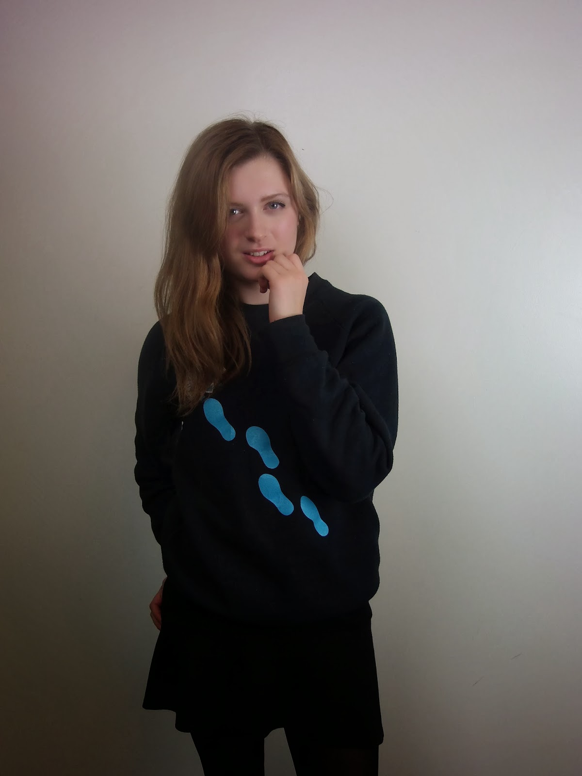
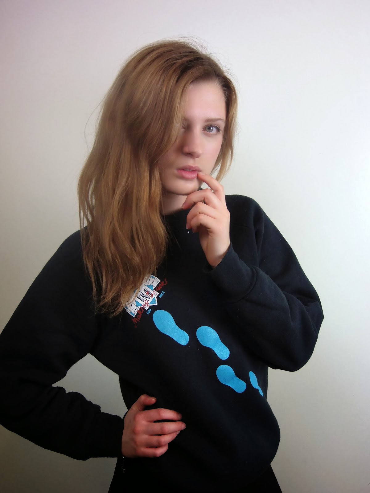
First Photo Shoot
These are the photos that I took during my first photo shoot using a Nikon camera. From taking test shots in preparation for the shoot I already had an idea of what lighting, background, positioning and angles/framing looked best on my model so when taking these photo's I had a clear idea of what I wanted my final photo to look like and so it was just finding the most effective photo for my front cover. I used 2 lights at either side of my model to try to cancel shadowing on her face and the background, this also helped to make all her features clear and visible giving the photo's a professional look. I used a plain background on my photo's because this will make any editing a lot easier and is also a convention that I have noticed on many magazines. It also again makes them look quite professional. I experimented with a few positions to make sure the Indie Rock genre was reflected through the image however I always made sure she was stood away from the wall to stop her from looking flat. I also experimented with a few camera angles and framing but generally used a straight angle and used a medium close-up shot due to these being conventions which work most effectively on a front cover. I didn't get my model to wear one of my planned outfits because they were created before I came up with the tag line that I was going to use. The tagline I have decided on is 'Lucy Bell hits the road' and so I thought that I would use the outfit that I have because the jumper has footprints printed on it and so this creates a connection between the image and the tag line which I thought was quite effective. I still managed to reflect the Indie Rock genre through the costume as her outfit is quite dark colour orientated which is generally what Indie Rock artists wear. My model also has a natural, messy/wavy hair and quite natural make-up which again reflects the Indie Rock style. This look is a possible final style for my front cover however I may take some more photo's which maybe include a leather jacket and some red lipstick to portray the Indie Rock look even more, giving me a wide range of options to choose from. Overall I believe these photo's are quite effective and will give my magazine front cover the professional look I am aiming to achieve.


Tuesday, 10 December 2013
Box Mock-up of Front Cover First Draft
This is my final box mock-up of my magazine front cover. The box mock-up shows where all of the features will be placed on my magazine when I come to creating it and it also represents the general layout of the front cover.

Monday, 9 December 2013
Final Front Cover Ideas
These are my final ideas for the things that I will feature on my magazine front cover. I have now decided on the: main story/headline; features; plug and artists that will feature on my front cover. Now I have completed this I can now start to create my first front cover draft.

Thursday, 5 December 2013
Front Cover Ideas
After conducting the planning and research that I have, I now have some ideas of the type of things that I may feature on my front cover. I have created a mind map which shows the possible main story/headline, feature stories, plug and included artists.

Tuesday, 3 December 2013


Thursday, 28 November 2013
Magazine Title Font Ideas
Once I had decided on the name of my magazine I started thinking about the font styles I could use for the masthead on my front cover. I used the website 'dafont.com' to get these particular fonts as they had a wide range to choose from so I could find the most effective font. All of the fonts are quite bold and catch your eye which is the effect I want it to have as the masthead is the most important thing on the page so you need to be drawn to it. I think that this is also effect because it juxtaposes the meaning of the word and the look of the word. The boldness of the font also reflects the music genre as Indie Rock is quite bold and rebellious.

Wednesday, 27 November 2013

Questionnaire on the Name of my Magazine
This is the questionnaire that I created and handed out to 20 people who also study media to help me decide on the name of my magazine. I did this so that I knew that the name not only appealed to me but also other people particularly people who liked the Indie Rock best as this ensures it will appeal to my demographic. Further more I asked media students as they should know what is appealing on a magazine and so this should help me to make my magazine as effective as possible.

These are the results that I collected for each of the questions in my questionnaire:

The results that I have collected have allowed me to see what people of different demographics think of the names that I suggested. I asked the participants their gender, age and music genre preference because I wanted to make sure that I asked people of a similar target audience to my own to make sure that the name of my magazine would appeal my target audience. I found that the participants were a mix of males and females, were all in their late teens and had a varied music taste however nearly half enjoyed Indie Rock music the best. This tells me that the results that I collect from this survey will apply to my target audience and so will ensure that when I decide on my final name for my music magazine it will appeal to my target audience. I then also asked them whether they read Indie Rock magazines or have done in the past because this will ensure that they know what is effective on a magazine and what appeals to them when they are buying a magazine. Over 3/4 of the participants I asked read Indie Rock magazines of had done in the past, the most popular amongst them all being NME. My magazine is going to be similar to NME magazine so this again tells me that my target market will be attracted by the name that is thought most popular and the name I will most likely use on my music magazine. The results showed that the most popular name for my Indie Rock music magazine was 'Conform' with over half of the participants liking this name the best and the second most popular name being 'Unknown' with just over a quarter of the participants preferring this name the best. On the survey I also asked peoples opinions on why they thought that this was the most effective name, this being the most helpful comment: "I think that the most effective name is 'Conform' because it stands out and is very memorable. If I was a customer looking to buy an Indie Rock music magazine then I think that this would appeal to me and I would be more likely to buy this magazine than a magazine with one of the other names based on initial impressions." In conclusion I have found that 'Conform' is the clear favourite and I also agree that this is the most effective name and so I have decided that this will be the name of my music magazine.
Monday, 25 November 2013
Style Ideas
These are my initial ideas for the costume, hair and make-up of my front cover model. I created 3 styles so that I have a wide choice to choose from when it comes to shooting the photos and I came up with a range of hair and make-up ideas so that I could experiment with them and see which looks the best. I only came up with styles for the female gender because I intend on using a female model on my final front cover. I have picked these styles because they reflect the Indie Rock genre and so will appeal to my target audience. Indie Rock artists also wear outfits similar to this and so it they will allow my genre of music to be understood straight away, whilst also making the magazine appear quite professional.


Thursday, 21 November 2013
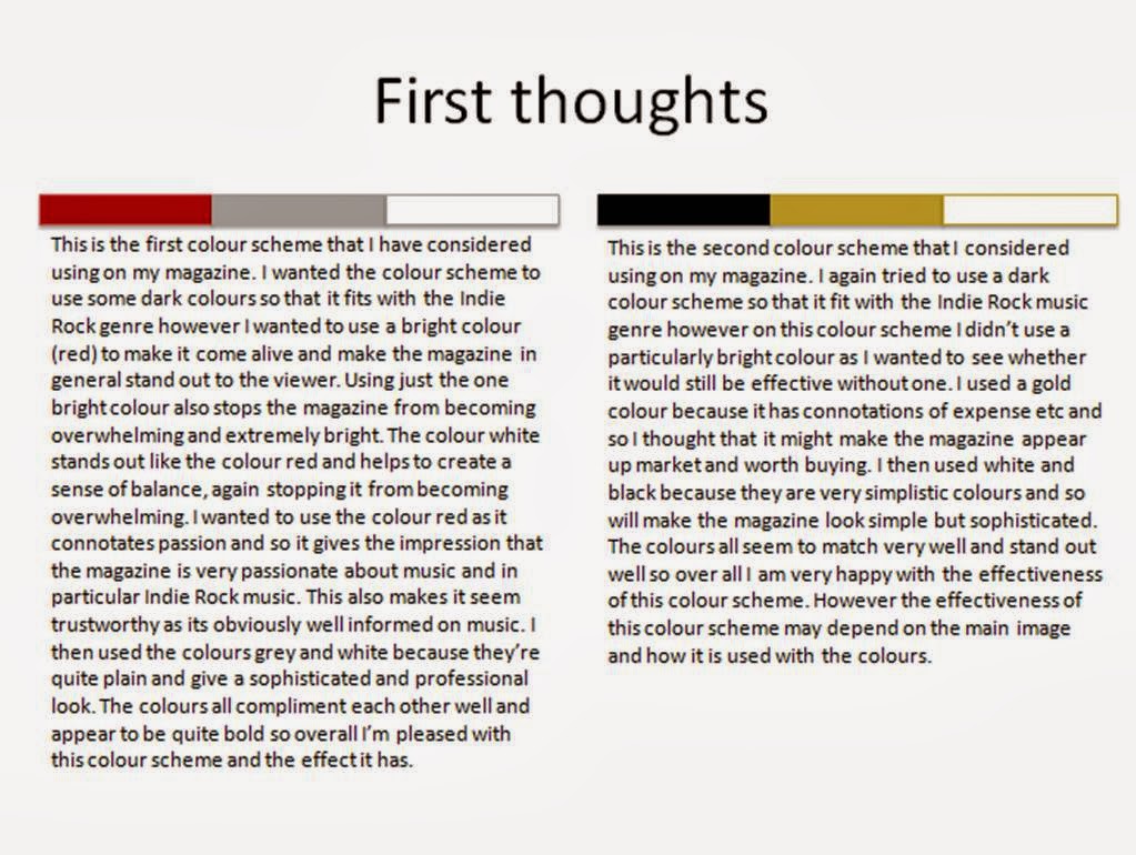
Colour Scheme Ideas
This is the research that I did into colour schemes in which I looked at different shades of colours, connotations of colours and existing products colour schemes. I then used this research to come up with some of my own colour scheme and make a final judgement of which to use in my magazine with the help of opinions from other Indie Rock music fans.


Subscribe to:
Comments (Atom)