Tuesday, 29 October 2013
Monday, 28 October 2013
Examples of bands from different music genres
Alternative:
Country:
Pop:
Jazz:
Classical:
Rock:
Dance:
R&B/Soul:
Wednesday, 23 October 2013

Monday, 21 October 2013
The main task
Main task: the front page, contents and double page spread of a new music magazine. All images and text used must be original, produced by you- minimum of four images.
Sunday, 13 October 2013
Evaluation
When producing my magazine front cover I considered lots of things and conducted many tasks to make sure that my finish product would be as professional as possible. I started off by conducting a conventions analysis of a 'Vogue' magazine front cover. I analysed the front cover in detail looking at the key conventions which I discovered were: a masthead; a main image; sell lines; a plug; a barcode; a price and a date/issue number. This helped me to begin because it gave me an idea about how a magazine front cover is laid out and the conventions which are on it so I could decide whether to follow them or not. I then conducted a LIIAR analysis of a magazine front cover so that I could see how professional and successful magazines represent their magazines to get across a message. This helped me to see how I can represent my own magazine to get across a message. Next I looked at existing college magazines and again looked at the conventions and the way they are represented to get inspiration for my own magazine. After this I looked at examples of shot types and took some photo's myself so I could see the difference between shot types for myself. This helped me to see what would be the best shot to use for my final product. Then I created a mood board to look at the different things I need to think about or include on my magazine front cover. This also helped me to identify my target market of students (aged 16-18) and parents. I then made a spider diagram which included all of my initial ideas and also again identified my target market. This allowed me to imagine what my final front cover could look like. Finally I made digital mock ups of a front cover, a contents page and a double page spread, which let me plan out where everything could be placed and see whether the finished product will look effective. All of this research helped me to create a college magazine front cover that is successful and appealing to my target market.
I then started the production process which involved taking photo's and using the software Photoshop to create my finished product. I took lots of different photo's of the college campus and my chosen models to give me a wide range of images to chose from, I experimented with different shots and angles etc and eventually chose a photo that I thought looked effective in attracting my target audience. Once I had chosen my photo I started editing it making sure that it looked professional by removing any unwanted things in the background and cropping it to an appropriate size. I also experimented with the brightness and contrast to make the photo look exciting. When I was totally happy with the photo I started creating my front cover. I placed the photo onto a plain A4 sheet of paper, then added my text and barcode. I wanted to keep to the Wyke colour scheme so used the colours purple and green, however this wasn't always visible against the background picture so I had to add a white coloured outer glow so that you could read the text better. Once this was complete my magazine front cover was complete.
I think that my front cover uses many conventions of real media products. In the planning process I researched many existing magazines to find out the main conventions which I could use in my own work. I wanted my magazine to look very conventional so that it was presented in the same way as a professional magazine and therefore looked realistic. I did this by incorporating the main elements into my own front cover whilst still making it look original. For example I used a medium close-up on my main image, I placed the masthead at the top of the page, I had a barcode and price in the bottom right corner and I also had sell lines around the models heads. I think using a medium close-up photo as my main image is very conventional because the majority of magazines use this shot as it allows you to see the models in just the right amount of detail. If I had used another type of shot I don't think that the finished product would have looked as realistic. The masthead being at the top of the page is very conventional and to challenge this convention would make the magazine front cover less professional so I again followed this convention. I put a barcode and price on my cover page because although they're not on the 'Vogue' magazine that I analysed I think it's essential for a college magazine. Finally I had sell lines around the models heads because this is where they are often founds and I again wanted to create this realistic look. It also makes them easily recognisable to the viewer as this is where they expect them to be.
I wanted my media product to represent a large range of social groups because colleges generally have lots of different groups of people with interests in different things. Therefore I aimed my front cover at all social groups within a college aged around 16-19. This meant that I needed to make sure that the topics I advertised on my magazine front cover where not all on one subject. For example I couldn't just advertise music in my sell lines because this would maybe only interest music students and not the rest of the college. This may also make people think that the college is mainly music based. I also had to make sure that the colours and fonts I used were not gender specific because this would again isolate a smaller audience. For example if I used the colour pink throughout viewers may think it is a magazine for females and if I used a very manly font such as Times New Roman viewers may think the magazine is aimed at males. To stop this stereotypical judgement happening I used gender neutral colours that were quite bold and vivid. I used purple and green throughout because they stand out due to them being contrasting, this also creates a theme which stops the magazine cover from becoming overwhelmed with colour. I also used a gender neutral font which was quite fun so that it didn't isolate a particular gender and represents the college itself as fun. I also carefully thought out the sell lines so that it attracted everyone. For example my first sell line read 'Revision tips inside!' as this applies to everyone because everyone is expected to revise for their subjects and my second sell line read 'Fresher's party tickets on sale now!' as this again applies to everyone because it is an open event. This reaches out to everyone inviting them to the event and again like the font used represents the college as fun because it suggests that it does these things often and isn't all about work. The image I used also appeals to a large range of social groups as the models are looking happy and are holding folders. This suggests that the college is good and they are enjoying studying there, we can see that they are students by the way they are holding folders. I think that the image suggests to people who aren't students that if you come to the college you will also be happy here. The name 'Wyke college' also appeals to all social groups as they all attend the college and so this is a mutual thing, it's also printed in purple which represents the college logo so they can all relate to it.
As I have mentioned previously my target market is 16-18 year olds initially and also parents. I identified my target market as this because 16 is the age you begin college usually and 18 is the age that you finish college generally and therefore these are the students that would be at college. However now I realise that some students stay onto college until age 19 and so it's also aimed at them. It's also aimed at parents because it shows them that it's a good college for their son/daughter. I think that my magazine front cover attracts this audience very well. It attracts the 16-19 year old audience because its conventional and therefore what they expect. It uses an obvious layout and a bright, contrasting colour scheme which appeals to the younger audience as it makes the cover come alive. It also uses interesting sell lines which appeal to all students especially the 'Fresher's party tickets on sale now!' line as the teenage audience likes to go out and have fun. The main image is also attractive to the student audience as the models are students themselves and so they can connect with the image. The image also attracts the parent audience as the models are smiling and so it suggests to them that they are enjoying their studies and their child will also enjoy going to the college. The background of the image shows part of the college campus which looks clean and like a good facility, therefore this will also appeal to the parent audience as it again represents the college as good for their son/daughter.
I have learnt lots of things about the different technologies while doing this project and think I have improved quite a lot since the perfume advert project. The main thing that I used on this project was the software 'Photoshop' and I think during this project I have improved my Photoshop skills a lot. For example on the original photo that I used for my main image the model to the left had a bag on her arm, however I didn't really want this there so I learnt how to use the clone stamp to remove it. I also coloured over the word 'Ash' on the side of the building because only half of the word was visible so I removed it completely. I learnt how to improve the brightness and contrast so that the picture stands out more as well. I also think I've learnt a lot about taking photo's, I've learnt how to use different settings on the camera such as the aperture setting. I have also learnt how to get a grid up on the screen to apply 'rule of thirds' to my pictures. Overall I think I have improved a lot since the last project.
Overall I am very happy with my finished front cover however if I were to do the project again there are a few things that I would do differently. Firstly I would leave more time to edit my photo more so that I could make it look as professional as possible. I would also maybe use a different text that stands out more and place this text somewhere else as the background interferes with it. I would plan out the layout more carefully as well so I know where everything is definitely going to go and where it will look effective. Apart from those things I think my magazine front cover looks quite professional and would appeal to my target market quite well fulfilling and satisfying everyone's needs.

Digital mock up of my contents page and double page spread

This is my digital mock up of my contents page which shows where I would place everything if I made a contents page. It includes the conventions that I discovered when looking at other examples of magazines contents pages.

This is my digital mock up of my double page spread if I were to make one. It shows where I would place everything and what I would have on the page. This also includes the conventions that I noticed when looking at other examples that I used as inspiration.
Unused photo's
These are the photo's that I took on my shoot which use models:


When taking these photo's I experimented with the different positions of the models and also changed the distance from the models whilst still maintaining a medium close-up shot, they are all very similar. The girls are holding folders and looking quite happy which suggests that they are enjoying college life so one of these images could be useful to use as it might not only appeal to the student audience but also the parent one. This is because its suggests that the college is good for their son or daughter. I took the photo's with the Wyke sign in the background because I thought this might draw the magazine to the college theme however now I realise this doesn't leave much room for a masthead if placed in the conventional place. Therefore if I use one of the above photo's I might have to edit it so that it has another background. I do however like having my models in the bottom left corner as it is the conventional place and leaves plenty of room for the other features.
These are the photo's I took on my shoot that include only the background:

 When taking these photo's I used a wide shot to get as much background in as possible to show the college campus and show to both students and parents that it is a good college to attend. The majority of the photos represent the college in a good way therefore achieving this.I took photo's in various places around the college but only a few of them are suitable for a college magazine. In addition to this, if I were to use one of these photo's I would need to crop it so it appears to be taken as a portrait because these photo's are landscape which isn't a convention of college magazines. However these photo's turned out quite well other than that.
This is the image I have chose to use for my final college magazine front cover:
 Out of all of the images I have taken I have decided to use this photo for my final front cover. I think this photo will work very well on the front of a college magazine because it clearly uses the campus background which links the photo to the main theme. Also the models look happy and are holding folders so you can easily tell that they are college students giving the college a good image. The image uses a medium close-up as this is a convention of many magazines and it also allows you to see the models more closely showing their facial expressions etc. The shot also allows enough room to place the masthead and sell lines so this is also a good feature of the photo. This photo needs some editing but not a lot and therefore means the photo will look as natural as possible giving the final front cover a professional look.


When taking these photo's I experimented with the different positions of the models and also changed the distance from the models whilst still maintaining a medium close-up shot, they are all very similar. The girls are holding folders and looking quite happy which suggests that they are enjoying college life so one of these images could be useful to use as it might not only appeal to the student audience but also the parent one. This is because its suggests that the college is good for their son or daughter. I took the photo's with the Wyke sign in the background because I thought this might draw the magazine to the college theme however now I realise this doesn't leave much room for a masthead if placed in the conventional place. Therefore if I use one of the above photo's I might have to edit it so that it has another background. I do however like having my models in the bottom left corner as it is the conventional place and leaves plenty of room for the other features.
These are the photo's I took on my shoot that include only the background:


Digital mock-up of my front cover

Initial ideas

Moodboard

This is a mood board I have created to give me a wide range of ideas about the different things I need to incorporate in my magazine front cover. Not all of them are relevant to a college magazine front cover but are things that I need to think about when creating my final cover. For example the colour wheel gives me ideas of the different colour schemes I could use, allowing me to think about contrasting and complimentary colours I could include.
My example shot types
 |
| Extreme close-up |
 |
| Close-up |
 |
| Medium close-up |
 |
| Mid shot |
 |
| Wide shot
These are the photo's I have taken using different shot types so I can see the difference between each shot and experiment with them for myself. This has helped me to see which shot to use for my own front cover.
|
Examples of shot types
Close up examples:
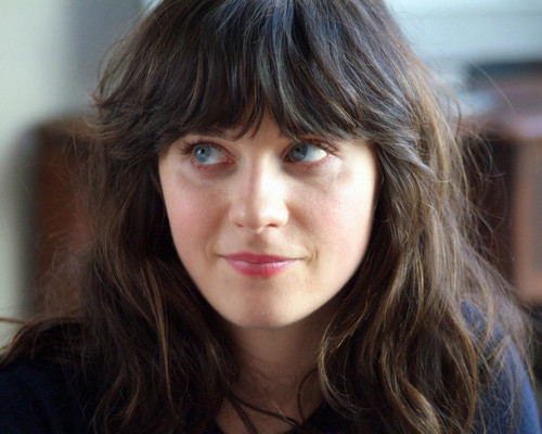
This is a close up shot of Zooey Deschanel in the movie '500 Days of Summer'. A close up shot is were a certain feature or part of the subject takes up most of the frame. In this case the close up is of the characters face. Close up shots are mostly used to exaggerate emotion as they focus intently on the facial expressions. They aren't used often on magazine front covers but are occasionally used inside the magazine itself.
Medium close up example:
This is a medium close up of Joseph Gordon-Levitt in the same movie. A medium close up is half way between a mid shot and a close up showing the face more clearly. In this example the shot is of the characters face and shoulders, excluding the majority of the background. This type of shot is often used on magazine front covers as it shows the face more clearly without being uncomfortably close.

Mid shot example
This is a mid shot of the main characters in same film. A mid shot is were a part of the subject is shown in more detail while still giving the impression of the whole subject. In this case the mid shot is of the characters from the waist up wards. Mid shots are usually used when the subjects aren't expressing a lot of emotion or in intense concentration. These types of shots are sometimes used on magazine front covers however medium close ups are more frequently used.

Wide shot example:
This is a wide shot of again the main characters in the film. A wide shot is were the subject takes up the full frame. In the example used they fill the photo leaving 'safety room' at the sides of the the subjects and above and below them.Wide shots are often used to show the subject in full giving an idea of the scale. Wide shots aren't commonly used on magazine front covers.
-days-of-summer-screenshot.jpg)
Two-shot example:
This is an example of a two-shot. A two-shot is a shot of two people, framed similarly to a mid shot. In this case the two-shot is of the main characters stood next to each other. Two shots are usually used to establish a relationship between the subjects. Two-shots are sometimes used on magazine front covers depending on the subject of that particular issue.
These are all examples of different shot types taken from the movie '500 Days of Summer'. This allowed me to establish between different shots and helped me to see which shot I have to use for my front cover.
Existing college magazines- analysis

The media
product to the left is a college magazine front cover, produced and manufactured by a
college. The cover is filled with information in the form of
text and images which represent the magazine in different ways. The first thing
I notice is the medium shot, main image of what seems to be a college student as he
is holding textbooks which suggests to me that the magazine is about students, for students. However I believe the magazine may also be targeted at parents as it is trying to convince them that the college is good for their son or daughter. This is expressed to the viewer by the way that the model is smiling at the camera as it suggests that he is enjoying his studies. The model is also staring into the camera implying the magazine is reaching out to you personally and including you in the college’s thoughts and ideas. The image isn't as bold as it possibly could be as he is dressed in very plain and dark clothing making him blend into the background slightly, however this does allow the white and yellow text to jump out at you. I think that the producers have purposefully made the man’s head
cover part of the masthead to suggest that it is a well established magazine. This
could have been done purposely to tempt people to read it as it suggests lots of people
have heard of it so it must be good. The use of a black background is unusual as it doesn't make the magazine stand out but it may have been used to represent the magazine as professional and
sophisticated. It also allows the yellow and white text to stand out, drawing your eyes
to the most important sections. This is specifically useful in drawing you to the masthead as it appears to be the brightest, boldest and biggest text on the page. The plug is also very eye catching as it is an extremely bright pink colour which isn't used anywhere else on the page. The colours used in the advert are gender
neutral along with the font of the text and so suggest it is aimed at a general
student audience and is not gender specific. The magazine cover uses lots of different fonts which make it more interesting. The fonts used are all very modern appealing to the younger generation and the magazines target market. The barcode, price and date are all placed in the conventional places again giving the magazine a professional touch. Overall I think that this magazine front cover is very effective and uses all the conventions that attract its target audience.

The media product to the right is again a college magazine which was designed and made by students and for students. The magazine cover again has a lot of information on it but less then the last example which I prefer as it comes across as more relaxed and simple. The main image stands out the most on the page as it is central and brightly coloured drawing your eyes directly to it. The photographer has used a medium shot which allows the 'i<3smu' T-shirt to be seen, implying that she believes it is a good college. This reaches out to the parent audience as it enforces the idea that it is a good college for their daughter or son. This is reinforced by the way that the model looks healthy and happy. The model is also staring into the camera which appeals to the student audience as it looks as though its reaching out to them personally tempting them and making them want to read it. The image is very bold using a bright red colour to catch your eye, this draws you to the magazine initially before you have the chance to read the exciting headings and sell lines. In addition to this the red colour also contrasts with the green background making it stand out even more. However this stops the sell lines etc from standing out as much compared to the previous example. Like the previous magazine the women's head slightly covers the masthead which has probably again been used to suggest that the magazine is well established and popular within the college. The producers have used a natural and outdoor setting for the background of the cover which I believe has been done to suggest that the magazine and the college is fresh. The background has been blurred which I think this has been done to make the focus the model and the text, especially the masthead. The masthead is the brightest and the boldest text on the page, the red colour blends with the red T-shirt that the model is wearing creating a bright colour scheme. The colours used on the cover are again gender neutral but are really bright and energetic to appeal to the younger generation and the magazines main audience. The fonts used are again very modern and easy to read appealing to the younger audience. The sell lines have very similar fonts and all use the colours black and blue which don't stand out as much as the sell lines on the previous magazine but I think this has been done so that the cover doesn't become too overwhelming. This magazine uses some of the most important conventions, such as the barcode in the bottom right corner and the date and price. This is very useful in making the magazine front cover effective and overall I think its a successful front cover.

The magazine to the left is a college magazine for students and parents made by the college itself. The magazine cover has a lot of text on it which stands out to the viewer instantly due to the bright colours, however the focus is the main image. The main image is a medium shot just like the other two examples allowing the model to be fully seen. The model is smiling and looking into the camera which I think has been purposefully done to make the viewer think that he likes this college and think its the right choice for potential students. This appeals to the parent audience as it makes them believe its a good college for their son or daughter. The model also appears quite 'cool' which may appeal to potential students and current students. Potential students might believe they can be like him if they attend this college and current students may believe they can be as 'cool' as him if they read the magazine. The model doesn't stand out as much as he possibly could due to him wearing quite dark clothing but due to the background colour being slightly lighter he still stands out. The dark clothing on the model and the dark background allow the bright blue and yellow text to stand out, this is what draws you to the magazine initially. Like on the other two examples the model's head covers part of the masthead which again has probably been done to show that it is an established magazine which lots of students and parents read. A dark background has been used again like on the first example which is quite unusual but it does allow the text to stand out and particularly the masthead. Your eyes are instantly drawn to the bright blue, bold and big masthead as it is the most eye catching thing on the page. I think this is essential as the the viewer needs to know what the magazines name is more than anything else so that they can purchase it again. The colours used in the cover aren't specific to any gender however I believe that the magazine would appeal to males more than females. The colours are vibrant and energetic and so stand out to the young audience. The sell lines all use a similar font but use different sizes. The bigger the size of the text the more your attracted to it you are and so they have put the most important sell lines in a larger text to draw you to them, this is really effective. This magazine also follows conventions by having a barcode, a price and a date on it, which is very effective in selling the product as it makes it look professional.
I have looked at these existing magazine front covers to look at the typical conventions found on a college magazine and also to get some ideas about my own front cover. It has helped me a lot and I have found many similarities between the three magazines which I am going to try to incorporate into my own magazine front cover.
I have looked at these existing magazine front covers to look at the typical conventions found on a college magazine and also to get some ideas about my own front cover. It has helped me a lot and I have found many similarities between the three magazines which I am going to try to incorporate into my own magazine front cover.
LIIAR analysis of a magazine front cover

The main image used on the cover is a medium shot and has many connotations, the most obvious being fairytale like. Alexa Chung is already seen as beautiful and almost princess like, this image reinforces that as she's wearing a pure white dress and has flawless skin making her look perfect. This links with the main cover line which read 'Enchantment' as she appears enchanting. The image also connotates adventure as she's also wearing a brown hat and jacket. The brown hat to me symbolises 'Indiana Jones' suggesting that she's going on an adventure. Alexa also has a strong and demanding pose which along with her eyes looking straight into the camera suggests that she is connecting with you individually making people want to buy the magazine to read about Alexa's 'couture adventure'. Alexa's head covers the letter 'G' in the masthead which shows that it is a very recognisable brand which is well established as people know that it is 'Vogue' without the whole brand being there. The masthead 'Vogue' is printed in a much larger text than anything else and stands out, it uses a very recognisable font which is used on every one of their magazines so that people know that they are reading 'Vogue'. However the masthead uses a different colour on every magazine to link to the overall colour scheme of the particular issue. On this edition they have used the colour pink as the colour scheme is white, pink and brown. This colour scheme has been inspired by the image as it uses brown and white, the pink text brings the magazine to life and reminds the viewer that it is a magazine for females. The pink also gives the magazine variety and depth as it would be quite plain and simple without it and I don't think as many people would have bought it on its appearance. In addition to this I think the pink links back to the connotation of a fairytale as this is the colour you mainly associate with a princess. The main cover line is printed in a much larger font than the rest of the text implying that this is what they want you to be drawn to, this line is also printed in quite a girly font again reinforcing the fact that the magazine is for women. The other text (the sell lines) are all printed in different fonts and sizes. Some of the text is printed in a very girly font and some of it is printed in a very strong and bold, which suggests to me that these are the sell lines that they want you to be drawn to more than anything else. Some of the sell lines are also very intriguing and make you want to read on into the magazine to see what it's about and so this is very influential in making the viewer want to buy the magazine. The last thing that I notice when looking at the magazine is the date in the top left corner, this is because it is in very small writing however still manages to stand out as it doesn't follow the colour scheme as it is printed in bold black. I think this is because the editor doesn't want that to be a main thing but just wants it to be able to be seen if looked for and is necessary.
Institution
Vogue is an international magazine which is now published monthly in 23 national and regional editions. It was first founded by Arthur Turnure in America in 1892 and came to Britain in 1916. As the years have gone by 'Vogue' has turned into a large global company which is very famous and is known as a fashion and lifestyle magazine. The publisher of the magazine since 2010 is Susan Plagemann and is said to have developed the magazine and its brand. The magazine is very successful which we can tell by looking at the models they use. All of their models are very famous and are role models, therefore if the magazine wasn't successful these big names wouldn't want to promote it. 'Vogue's' success keeps on growing as they find more ways to increase their profits all the time, for example they have recently made the magazine available to download on peoples phones and other technologies hugely increasing their profits. You can also subscribe to 'Vogue' so that you receive each issue. 'Conde Nast' currently owns 'Vogue' which are a huge company known for working with big brands like 'Gucci' and 'Chanel'.
Ideology
There are many beliefs and values that this magazine expresses and communicates to the reader, the main being wealth. 'Vogue' is probably the biggest fashion magazine in the world and it knows this and so is not afraid to challenge conventions. The use of famous female models shows their wealth as well because normal magazines couldn't afford to hire these people to be on their magazines, these models also make the magazine appear trustworthy as they are people we look up to. The wealth of the magazine also gives it a high class feel and makes the women who buy the magazine feel special and like they are part of a society. This high class look also comes across in the main images, the models always have little make up on and are very natural which shows that they don't have to make their models outstandingly unique to make people intrigued as this is not the audience they are reaching out to and are instead trying to attract middle aged adults. Another main ideology of the magazine is sophistication, the magazine always uses a sophisticated layout which sticks to a colour scheme and never looks over crowded.
Audience
The magazines main audience is middle aged adults (20-35 year olds) due to it being sophisticated and a high cost. This is because the sophisticated look doesn't tend to appeal to the younger generation as they often look for outstanding colours and wild models (for example cosmopolitan) and the high cost of £4.10 means they can't generally afford it, whereas the older generation often have paid jobs and so can afford to indulge in the magazine. The magazine also advertises a lot of expensive goods that aren't just found on the high street like the items advertised in glamour, therefore the magazine's audience is also wealthy people. The use of middle aged women on the cover the majority of the time is a big signifier that the magazine is for middle aged women as it will appeal to them more, whereas teenagers are less likely to want to buy it. The magazine is also aimed at people who have a keen interest in fashion as it is the biggest fashion magazine. Vogue have also made many other magazines to accompany the ever growing target market, these include: Vogue men, Vogue teen and Vogue living.
Representations
Alexa Chung is the model used for the main image on this magazine and think she links with the genre of the magazine very well. This is due to her being the same age as the target audience and due to her being known for her fabulous fashion style. This makes people want to buy the magazine as they may think that they can look and dress like her., she therefore acts as a very good role model for providing tips about fashion again making the magazine trustworthy. Her brown hair and her clothing also links with the colour scheme of pink, brown and white. Alexa is also looking directly into the camera and pulling a confident face which includes the audience in the magazine saying if you want to look like me read this magazine. Alexa Chung is seen as being very cool and so people may associate the magazine as being cool in future issues and will carry on buying the magazine increasing the number of readers.
Conventions analysis of a magazine front cover

Subscribe to:
Comments (Atom)